 You may already have been enjoying the all new Scottish Games Network logo. The crisp clean lines, the reassuring solidity of the cube and the clever integration of the three primary letters ‘S’, ‘G’ and ‘N’ into the structure of the logo itself.
It contains no gradients – the kiss of death for any logo – and is both contemporary and classic. It looks freaking awesome at almost every size, from favicon and would, we imagine, grace anything up to the size of a billboard, or indeed projected onto the Moon.
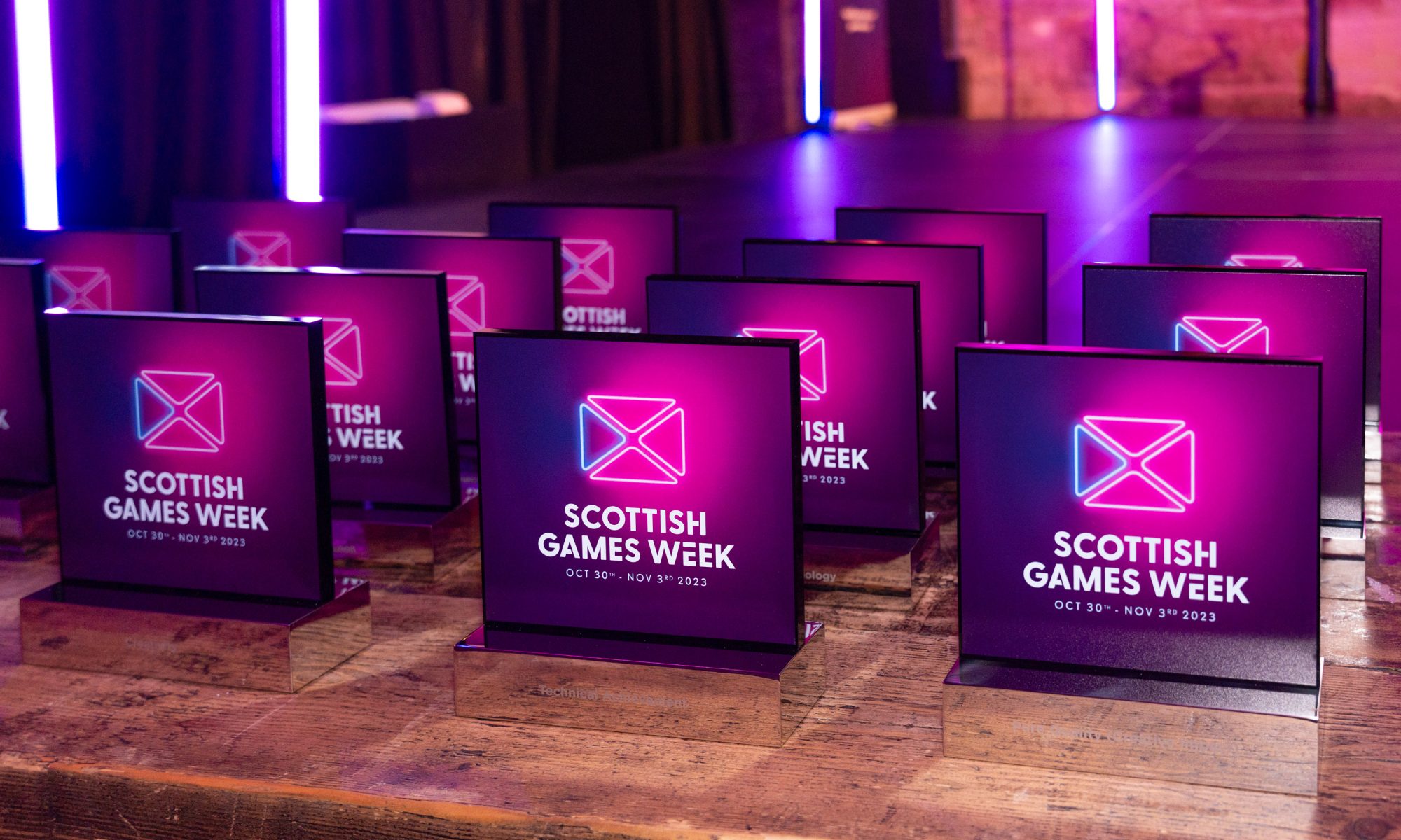
It would be simplicity itself to turn the new logo into an etched or engraved trophy or award, given out to deserving companies in an awards ceremony focusing on the interactive sector in Scotland, or given by the interactive industry to deserving public servants who have supported and promoted the industry in the recent past.
The concept for the new logo was conceived by your editor, after experiencing an Ayhuasca ritual in the Amazonian basin in the late 1970s. It was implemented and executed by the ferociously talented Matt Zanetti from Guerilla Tea, based upon an original sketch which can be seen below.
 This is the first of many new updates and improvements to the Scottish Games Network as we professionalise, monetise and expand the network to become something far more significant and of value to the entire industry.
In the meantime, we’d like to thank Mr Zanetti for his hard work and pro-active approach to this project and we can recommend Matt and the Guerilla Tea team to the industry as a whole as a shining example of rectitude and professionalism.
Looks fantastic!